My Aoshima Apartments building got a Tomix 7-11 on the ground floor, and a lobby for the apartment complex itself. The lobby section is all scratchbuilt and is generally pretty spartan. However, I did paint some remnant strips of styrene in shades of tan and brown to simulate furniture. On the windows, packing tape is used to simulate window coverings.
As long as I'm talking about 7-11....when I first got this building, it came with stickers of rendered store shelves to be placed inside the store. I though this was cheezy and wouldn't' look very good. I was actually surprised....you don't need a lot in N Scale to give the impression of something (as long as you don't get too close!).
Kato usually makes interior decoration really easy with their cast-in furniture on many of the ground floors of their buildings....this Kato 23431B is an example of how little effort it takes to create an interesting interior. A few dabs of paints, some lights, posters (or an random sticker) for the walls, a few figures and you're good to go!
The upper floors of this building recieved some decorations. The top floor has a guy sitting on a couch, the 2nd floor contains a conference table in a more 'office' type of environment.
I put a lot of effort into my frustrating 3rd skyscraper scratch-build project. This building is still unfinished - and may never be! - but some of the interior work turned out pretty well. The below lobby was created using two remnant pieces of plastic from some kit to make flower boxes. The walls are inkjet printouts.
I got a bit bold and bought an HO Office Furniture kit made by Kibri. As you'd expect, its all pretty over-sized, but by cutting the legs off of the conference table chairs they somewhat work in N Scale. Some of the other shelves, desks and other pieces work okay if you don't look too close, but I won't be using these pieces going forward. Too big and too expensive given the fact that they're just not right.
As always, falling back on my 'homemade' cubicles. Note that the LED's are in the foreground to ensure that the light is cast on the subject....
The below two buildings(Faller b-905 and an unidentified German kit) again feature typical 'retail store' interiors. In this case, more of the 'shelving images' output with an inkjet printer and then glued to foam core and/or styrene or plastic scraps.
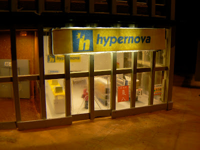
Here's another photo of the 'Hypernova' store interior on the ground floor of the Faller B-905 building without the protesters in the way (click here for that story).
Again, this old kit I got off ebay was converted into a '24 hour' market....
On the ground floor of my Atlas Skyscraper, I installed an 'HMV' music store. Thinking a little bit about the difference in colors that a music store would have (compared to a market for example) helped to give this a pretty convincing look.
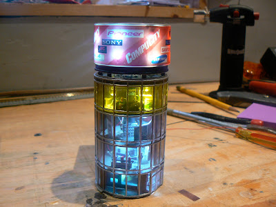
Again, Kato makes it easy sometimes to not have to do a lot to give a level of detail that is basically effective. The below is the ground floor of the a Kato 23435 and it just uses the as-provided set of stickers combined with some LED lights to give the right feel for a real business.The Tomix "Cylindrical Building" is a favorite givens its distinctive look and shape! I made mine into a "CompuCity" (made up store) and added retail shelving, displays and lights to all four floors of the 'cylinder'. The top floor is a cafe of sorts rather than pure retail. A lot of the 'foam core' shelves and retail displays hide the LED leads and wires.
To a certain degree, I wish I was using more SMD led's back when I put this building together, although they do have the look of oversized lamps, having them be a bit more subtle would be nice.
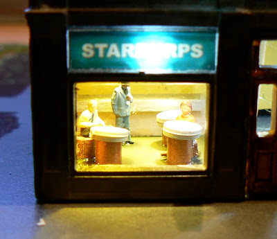
On the ground floor of my "Hilltown Hotel" kitbash I added a Starburps.....
And a "Pret a Manger":
Does Quinntopia really need yet more fast food? Apparently there is no end to it as this Greenmax kit shows! Here's a "Burger Konig", which was another one of my very early attempts at back-lit signage and interior detailling, so not without a few learning experiences here....
My very first 'skyscraper' was the blue Kato 23433A 6 story office building. One of the first things I did was to glue the floors together. Yeah....whoops. I was later able to go back and at least light the ground floor up which, again thanks to Kato's cast-in furniture and supplied decals, give you a credible looking interior with minimal effort.
And finally, this Tomix 4051 Square Office building became a car dealership. A few posters, some paint, cars and figures are enough to add some diversity to the retail and dining establishments of Quinntopia!


Hi, I've just started lighting my buildings. I am wondering how you got the sign illumintated on the top of the Kato Cylindrical
ReplyDelete