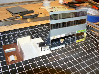
The motivation for this building came from the desire to have a modern-looking skyscraper with the common 'mirrored' glass windows so common on modern buildings.
While I used some similar methods for this building as I did with "Godzilla", the materials are significantly different. First, this building started off as fairly standard clear acrylic sheets (about an 1/8" thick), rather than 1/2" thick 'smoked acrylic' as used on the first building.
The second major difference is that I used window film (typically used to darken car windows) with a 'mirror' appearance to get the affect I was looking for.
Again, I used a straight-edge and an Xacto knife to score the acrylic to simulate window and other surface seams. As opposed to my other building, the scoring on this building is vertical. I also played around with the idea of using very thin strips of painted styrene for the vertical separations. You can see what this looks like compared to a building face without the strips in the below photo. I wasn't really that taken with the styrene strips versus just the scoring, so I did not use this approach.
To create the impressions of floors in this building, I masked out the actual 'window' areas' and then painted the non-window flooring areas.
My measurements for these areas are:
- Floor to Ceiling: 18mm or approximately 3/4"
- Window area: 13mm or approximately 1/2" (which, by fortune, is also the width of the masking tape I used)
- Floor/non window area: 5mm or about 1/4"
I did find a use for the thin strips of styrene on the ground floor, to create the window and door frames for an otherwise plain 'plate glass' street front for the building.
 From this point, I started to assemble the four sides, with the large 'vertical column' (which was also 'scored' to have a consistent appearance to the rest of the building design) the progress of which is shown in the photo at right.
Which pretty much leads to the point where I am at right now, which is shown in the photo at the top. The remaining tasks include some final detailing, particularly on the ground floor, building a roof, adding the lighting and interior details, masking some of the 'windows' on several floors to give off the effect of unoccupied floors, etc... and coming up with a corporate name/logo to emblazon on the top of the building.
I'll post photos of the final product once I've got it completed, but wanted to share this experience as it was a different approach than the first building.
A final comment is that using masking tape to create your window areas actually worked really well. It is really important to ensure your tape has a good seal as the paint will seep through (and require time consuming clean up!). I used a good quality grey primer spray paint for thus purpose. Not the prettiest of colors, but a good neutral color for a building of this era I think. I expect I will use this spray paint/masking tape technique again in the future for other modern structures, as it doesn't require the tedious task of cutting styrene and is fairly inexpensive.
UPDATE:
Building was finally completed several months later...click here!


I think this one is looking even better than the last one!
ReplyDelete