Except for a Modemo Mo3501 "Sala-Go"....
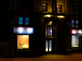
Wandering through empty streets....
But with plenty of light....
Perhaps its the Eve of Christmas and everyone's at home with family and friends? Merry Christmas/Happy Holidays!
▼
12.24.2010
12.23.2010
Interior Modeling - Part 2
I covered most of my 'interior modeling' projects in Part 1, but there are still quite a few that I've never talked about so this post should complete them all!
My Aoshima Apartments building got a Tomix 7-11 on the ground floor, and a lobby for the apartment complex itself. The lobby section is all scratchbuilt and is generally pretty spartan. However, I did paint some remnant strips of styrene in shades of tan and brown to simulate furniture. On the windows, packing tape is used to simulate window coverings.
As long as I'm talking about 7-11....when I first got this building, it came with stickers of rendered store shelves to be placed inside the store. I though this was cheezy and wouldn't' look very good. I was actually surprised....you don't need a lot in N Scale to give the impression of something (as long as you don't get too close!).
Kato usually makes interior decoration really easy with their cast-in furniture on many of the ground floors of their buildings....this Kato 23431B is an example of how little effort it takes to create an interesting interior. A few dabs of paints, some lights, posters (or an random sticker) for the walls, a few figures and you're good to go!
The upper floors of this building recieved some decorations. The top floor has a guy sitting on a couch, the 2nd floor contains a conference table in a more 'office' type of environment.
I put a lot of effort into my frustrating 3rd skyscraper scratch-build project. This building is still unfinished - and may never be! - but some of the interior work turned out pretty well. The below lobby was created using two remnant pieces of plastic from some kit to make flower boxes. The walls are inkjet printouts.
I got a bit bold and bought an HO Office Furniture kit made by Kibri. As you'd expect, its all pretty over-sized, but by cutting the legs off of the conference table chairs they somewhat work in N Scale. Some of the other shelves, desks and other pieces work okay if you don't look too close, but I won't be using these pieces going forward. Too big and too expensive given the fact that they're just not right.
As always, falling back on my 'homemade' cubicles. Note that the LED's are in the foreground to ensure that the light is cast on the subject....
The below two buildings(Faller b-905 and an unidentified German kit) again feature typical 'retail store' interiors. In this case, more of the 'shelving images' output with an inkjet printer and then glued to foam core and/or styrene or plastic scraps.
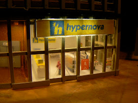
Here's another photo of the 'Hypernova' store interior on the ground floor of the Faller B-905 building without the protesters in the way (click here for that story).
Again, this old kit I got off ebay was converted into a '24 hour' market....
The Tomix "Cylindrical Building" is a favorite givens its distinctive look and shape! I made mine into a "CompuCity" (made up store) and added retail shelving, displays and lights to all four floors of the 'cylinder'. The top floor is a cafe of sorts rather than pure retail. A lot of the 'foam core' shelves and retail displays hide the LED leads and wires.
To a certain degree, I wish I was using more SMD led's back when I put this building together, although they do have the look of oversized lamps, having them be a bit more subtle would be nice.
On the ground floor of my "Hilltown Hotel" kitbash I added a Starburps.....
And a "Pret a Manger":
Does Quinntopia really need yet more fast food? Apparently there is no end to it as this Greenmax kit shows! Here's a "Burger Konig", which was another one of my very early attempts at back-lit signage and interior detailling, so not without a few learning experiences here....
My very first 'skyscraper' was the blue Kato 23433A 6 story office building. One of the first things I did was to glue the floors together. Yeah....whoops. I was later able to go back and at least light the ground floor up which, again thanks to Kato's cast-in furniture and supplied decals, give you a credible looking interior with minimal effort.
My Aoshima Apartments building got a Tomix 7-11 on the ground floor, and a lobby for the apartment complex itself. The lobby section is all scratchbuilt and is generally pretty spartan. However, I did paint some remnant strips of styrene in shades of tan and brown to simulate furniture. On the windows, packing tape is used to simulate window coverings.
As long as I'm talking about 7-11....when I first got this building, it came with stickers of rendered store shelves to be placed inside the store. I though this was cheezy and wouldn't' look very good. I was actually surprised....you don't need a lot in N Scale to give the impression of something (as long as you don't get too close!).
Kato usually makes interior decoration really easy with their cast-in furniture on many of the ground floors of their buildings....this Kato 23431B is an example of how little effort it takes to create an interesting interior. A few dabs of paints, some lights, posters (or an random sticker) for the walls, a few figures and you're good to go!
The upper floors of this building recieved some decorations. The top floor has a guy sitting on a couch, the 2nd floor contains a conference table in a more 'office' type of environment.
I put a lot of effort into my frustrating 3rd skyscraper scratch-build project. This building is still unfinished - and may never be! - but some of the interior work turned out pretty well. The below lobby was created using two remnant pieces of plastic from some kit to make flower boxes. The walls are inkjet printouts.
I got a bit bold and bought an HO Office Furniture kit made by Kibri. As you'd expect, its all pretty over-sized, but by cutting the legs off of the conference table chairs they somewhat work in N Scale. Some of the other shelves, desks and other pieces work okay if you don't look too close, but I won't be using these pieces going forward. Too big and too expensive given the fact that they're just not right.
As always, falling back on my 'homemade' cubicles. Note that the LED's are in the foreground to ensure that the light is cast on the subject....
The below two buildings(Faller b-905 and an unidentified German kit) again feature typical 'retail store' interiors. In this case, more of the 'shelving images' output with an inkjet printer and then glued to foam core and/or styrene or plastic scraps.
Here's another photo of the 'Hypernova' store interior on the ground floor of the Faller B-905 building without the protesters in the way (click here for that story).
Again, this old kit I got off ebay was converted into a '24 hour' market....
On the ground floor of my Atlas Skyscraper, I installed an 'HMV' music store. Thinking a little bit about the difference in colors that a music store would have (compared to a market for example) helped to give this a pretty convincing look.
Again, Kato makes it easy sometimes to not have to do a lot to give a level of detail that is basically effective. The below is the ground floor of the a Kato 23435 and it just uses the as-provided set of stickers combined with some LED lights to give the right feel for a real business.The Tomix "Cylindrical Building" is a favorite givens its distinctive look and shape! I made mine into a "CompuCity" (made up store) and added retail shelving, displays and lights to all four floors of the 'cylinder'. The top floor is a cafe of sorts rather than pure retail. A lot of the 'foam core' shelves and retail displays hide the LED leads and wires.
To a certain degree, I wish I was using more SMD led's back when I put this building together, although they do have the look of oversized lamps, having them be a bit more subtle would be nice.
On the ground floor of my "Hilltown Hotel" kitbash I added a Starburps.....
And a "Pret a Manger":
Does Quinntopia really need yet more fast food? Apparently there is no end to it as this Greenmax kit shows! Here's a "Burger Konig", which was another one of my very early attempts at back-lit signage and interior detailling, so not without a few learning experiences here....
My very first 'skyscraper' was the blue Kato 23433A 6 story office building. One of the first things I did was to glue the floors together. Yeah....whoops. I was later able to go back and at least light the ground floor up which, again thanks to Kato's cast-in furniture and supplied decals, give you a credible looking interior with minimal effort.
And finally, this Tomix 4051 Square Office building became a car dealership. A few posters, some paint, cars and figures are enough to add some diversity to the retail and dining establishments of Quinntopia!
12.19.2010
December Layout Update
As you can see from the above photo...we have LIGHTS in the city! About 40 or so (not sure of the exact count!) Viessmann 6490 street lights were installed in the 'sidewalks' since my last update. Great to have so much of this work done, but I still need another 6 or 7 lightsto have street lights installed in all the spots they should be! Still need to adjust some of them to ensure they are all standing up perfectly straight etc.... and at some point I'll add in traffic lights, but for the time being, this is enough so that I feel like I can start to add the buildings!
In addition to lights, I've also been focused on getting as much of the track work done so that I can get back to running trains over the holidays...a big part of that has been getting the new freight yard mostly complete so I'll have a place to park the trains when they're not running.
And a lot of time has been spent wiring....I replaced all my power wires (which was originally just multiple extensions of Kato power cords / 3 way adapters) with a real 14 gauge 'power bus', added power to all the 'expansion' trackage, and have been working on powering up all the 'main line' and some of the yard switches. Below is the current appearance of what will ultimately become my "TCO", or control panel (as we say in English)!
12.12.2010
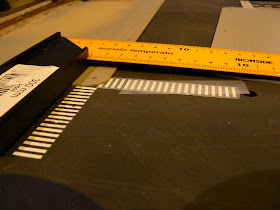
Street Markings in N
12.07.2010
Interior Modeling - Part 1
The back side of the building got an interesting addition...a parking garage entrance! This was actually pretty easy. I used various thin pieces of styrene to give the impression of the sort of cabinets and storage doors that you'd see in this sort of entrance, even glued some thin wire to simulate pipes to the walls, and gave it a coat of grey paint. The 'parking' signs are something I just created on my own.
I have to say, this is one that I'm still pretty proud of...with the exception of one error. As I knew from the beginning that this building was a perfect office building, I knew I wanted to stock it with office cubicles. As their is no such thing available in N Scale, I had to make my own using corner sections of styrene glued to flat sections. Very basic, but they work. Office chairs are another problem, so I basically just positioned most of the cubicles so you wouldn't see the chairs when looking in (so they aren't actually there!).
One major flaw with this is that the floor didn't get glued in correctly, so it totally bends...argh!!! You can see the bottom of the floor bending up over the window.
The ground floor of this office building got an 'espresso bar', some planters with shrubs and various posters. A couple of 'gag's in this building are the 'successories' poster ("Teamwork"- barely visible on the back wall of the office cubicle photo above), and the "Big Brother is Watching" poster in the ground floor lobby (below). Most of the other posters and images were taken from the unused sticker sheets from Greenmax, Tomix or Kato kits.
Vollmer 7726 'double up':
This is a building mod I did a long time ago that I've never talked about, but its basically two Vollmer 7726's doubled up. It turned out pretty well and I'm still kind of fond of it despite that it was one of my earlier attempts. The ground floor uses some colorful paper and some N scale figures to simulate mannequins, while the fourth story on this building has its drapes open and three people in one of the residences are visible.
One error I made with the fourth story detail, is that I inadvertently glued the floor at the bottom of the window frames, which looks silly, but I can live with it for now. Lesson learned....The ground floor of this building turned out pretty well...this building predates the same techniques I used in the "Star Tower" ground floor. I think I covered this one pretty well in my original post. Note the 'wall coloring' of the "Greasy Taco" restaurant was another design I just created on my inkjet printer. Nothing fancy!
Faller 2227 "Shakey's & Hobby Shop"
I had a lot of fun with the ground and upper floors on this building, but some of this work was wasted. n the ground floor I included both a hobby shop and a pizza parlor. The below image shows the ground floor before installation, and you can get a pretty good idea of the standard techniques I use to create interior furniture, etc....
I had a lot of fun with the ground and upper floors on this building, but some of this work was wasted. n the ground floor I included both a hobby shop and a pizza parlor. The below image shows the ground floor before installation, and you can get a pretty good idea of the standard techniques I use to create interior furniture, etc....
Where I probably wasted more time than I should have is on the upper floors, where I made a fairly elaborate residence - a couch, ottoman, dining table, wallpaper and paintings on the wall - as can be seen below. There's also a bedroom behind the 'living room ' wall:
Unfortunately....once this was installed, it was barely visible through the windows!
This building was a painful learning experience...a "Games Workshop" store on one side had some of my typical retail interior work which was unfortunately marred by 'fogged' plastic from using CA glue on the clear plastic. I've since learned this is a 'no no'. At some point I'll try and go back and replace the glass.
On the opposite side are more self-made restaurant tables and some paper with a checkerboard design pasted into new interior back walls for the "Lumberjacks 24 Hour Diner":
Kato 23-434A Office Building:
Another building that is both 'doubled-up' from two kits is this Kato office structure. This building again features kit-bashed office cubicles, random stickers from Tomix, Greenmax and other kits, and neutral paint tones on strips of styrene to create walls to give the effect of a real office environment.


