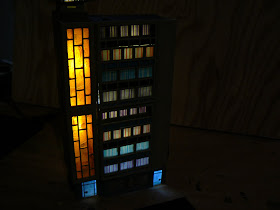
I purchased a Vollmer 7728 N Scale Gift Shop almost a year ago. It sat on the shelf while I tried to figure out what to do with it, until I finally decided to order
 another one and attempt to make this a much taller building than the original designers intended, similar to what I did with the Greenmax 29 building. This was a very tricky kitbash, as the front of this building has unusual recesses and different windows on virtually each floor.
The first step, whenever I put together a new building, is get a paper towel and some water and clean off the sprues. I then remove the parts from the sprues and paint
 them (given how light the parts are, I usually place them on some masking tape so they don't go blowing off onto the ground or worse!). If I plan to light the building interior, I also put a coat of paint on the inside walls to ensure that no light can pass through the plastic walls.
My final plan was to combine the top two floors of each model together, as these floors are all 'recessed'. That will make the bottom four floors flush with the building front. I ended up having to use some styrene strips to make the entire front look seamless.

This is another 'fashion' store (I'm getting my daughter to help me come up with store ideas, and she thought my city needed more fashion stores!) but rather than use mannequins (e.g. N scale figures) in the shop windows as I've done with other stores, I just used images that look like those you'd see in a fashion store window. I sort of expect that this building won't be as visible as others, so I didn't go overboard with a lot of detail like I tend to do with others!
Again, lot's of LED's went into this building, and there is even one floor where the
 apartment dwellers can be seen inside (although the photo here is pretty crappy...can't get the camera to focus on the interior!). For most floors, I used the 'window coverings' that Vollmer includes...these do a nice job of simulating drapers and ensure that there's a bit of variety on every floor like you'd expect from a 'real' apartment building.
On the back side, there are large windows that I diffused with some laquer spray and overlaid with some clear orange acetate. I don't even know if this side will be visible but...well, at least its done.

All in all, this will be a bright - and colorful!- building on the layout! I still haven't decided what the roof sign will be yet (the sign up there now in the photo is a placeholder) but that can be worked out with other details later!


Yet another structure to fuel my jealousy :D
ReplyDelete