5.18.2009

Layout Version 2 Overview

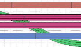
I talk about my final selection of RailModeller to help me design (and redesign) my layout in this post here.   In this post, I'll share with you the 'plan' and an overview of the layout.  Below is the current plan.   The 'grey areas' are elevated sections (about 2" high).  The three main colors represent three seperate lines (red and pink are the same line, but the red color is 'pink' where its elevated, if that makes sense!).
So here is a break down of my three lines, with some photos to give some perspective on where they are on my layout.

THE THREE LINES AND COLOR CODES:


RED LINE:
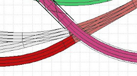
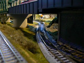
The "Red" Line is the main line. This is the line with two 2% grade (using Woodland Scenics grade risers); one goes up...the other brings it 'down'.    I colored the actual grade sections in a sort of 'orange/peach' color. The elevated portion of the main line is in 'pink', while the bottom level is 'red'. The idea was to change the colors as the elevation rose.  The below photo shows the Relay Tsubame on one of the two 'main line' tracks that makes sort of a siding on the bottom level as the main line comes down the grade.  The elevated section of this same line is the track closest to the camera on the bridge in the background.
On the other side of the layout from the yard, is a long stretch of track using Woodlands Scenics 2% grade risers to get an elevation of a little over 2 inches.
After coming off the grade shown above, the main line enters some single track Kato viaducts where it curves around and crosses over the main line and the "green line".  From here it continues to where the viaduct is seen in the background in the above photo with the yard.

BLUE LINE:
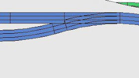
The "Blue Line" is the 'suburban' line. This line is on the higher level. Its just a basic 'dog-bonish' loop that runs inside the main line on the elevated section of the layout. Unfortunately, some of the double track sections are in red when they should be blue (see above). The three cool features on this line are an extra long siding (part of an abandoned plan that would have included another inside loop!);
 the Suburban station (in...uh...my 'downtown'),
 and the rock cliffs:

GREEN LINE:
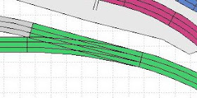
The "Green Line" is sort of the 'country' line. It runs on the 'ground' level, and spends most of its time meandering under bridges....
 and through a relatively long tunnel on the top right that is hidden by a long piece of sintra that has trees and ground cover on it. The picture below shows the tunnel area with the cover removed:

GREY AREAS
The 'grey areas' are yards or industrial sidings.
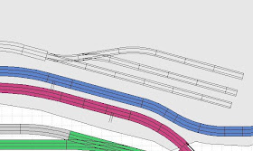

While most of the yards and track are Kato Unitrack, there is a small industrial spur that comes off the blue line on the elevated section. This is mostly Minitrix track and switches.
And finally, there is a small loop on the left side of the layout that comes off the 'Green Line' and sits at the 'ground level', which I did not add to the plan. This loop will likely be removed and replaced with one end of a point to point trolley line I am thinking about adding.

5.17.2009

17 Story Skyscraper Complete!


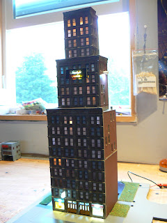
After nearly 2 months of near total monopoly of my 'hobby' time, I was able to complete the final assembly of my 17 Story Skyscraper! This building was inspired by some of the buildings that I found here using the DPM "Hilltown Hotel" kit. I used 3 kits to complete this building.

This is a fairly typical, mid-century American style skyscraper. I really wanted a larger, gothic looking structure to sit in the center of my city, and in general I'm fairly pleased with how its turned out.

Some of the features I added to it:

• A "Starburps" and a "Pret A Manger" on the ground floor. Both the Starburps and Pret a Manger signs are backlit with LED's on clear plastic on which white polyster adhesive paper is applied that was printed using a color laser printer (Kinkos). If you've read some of my earlier posts, I've been using the standard water-slide decals and color ink-jet printer, but was just not getting the color quality that I wanted. This white adhesive paper works great for these applications, providing almost commercial-level quality (although the laser toner will rub off easily).
The "Starlight Lounge", which is on about the 12th Floor or so, and features color-changing LED's (in this case I again used the color laser copier from the neighborhood Kinkos and but print my art on transparent, overhead projector sheets and not the white adhesive paper used for the signs on the ground floor).

I spray-painted it with PolyScale "Concrete" and gave it a wash with Games Workshop Brown and Black ink, which really 'filled' in the cracks and makes the details in the castings pop out! Its not seamless, of course, as the kit only offers a couple of methods of doing cornices, so with some Games Workshop 'green stuff' was able to 'fake it' a bit in some areas so that the building appears to have the cornices and abutments where they should be.

The great thing, with this big project out of the way, I can spend some time on some smaller projects and start to enjoy the summer!

5.15.2009

Layout Design Software


Well, its been a few weeks since my last post. The nice weather will no doubt take some time away from trains over the next few months, but I've still got plenty of projects to keep my busy.

One of those projects has been getting a new 'digital' recreation of my layout built on my Mac - so I can play around with some ideas for the layout that have been in my head.

Since I really wanted a track layout design program that was Mac OS X native, that limited my choices. I looked at Xtrakcad (and found it difficult to use on my PC), I've used RRTrack in the past (which was okay), looked at WIntrack (no Tomix library) but none of these had either the ease of use or Mac compatibility that I was looking for.

I finally ended up going with RailModeller. Despite its biggest drawback (no elevations or grades!), it works great on my Mac, has an easy interface, and very nice looking schematics.

An initial result of my RaiModeller efforts is the image posted above, which is my current layout (and what I refer to as 'Version 2') To see a bigger image of the trackplan/layout, click it and it will open at a large size.

RailModeller was easy to use (but my advice is before you buy, check out their free demo). However, some of the product descriptions were still in German (the Fleischmann and Tomix libraries are two examples) and -not sure if its me or the program- but there are places where the actual track I have on the layout just won't fit (keep in mind, I did this backwards. As the layout is done, I had to check the track on my layout then entered it into the design program). This forced me to take some creative license in some areas and, for example, leave out a 64mm straight, add a 29mm straight, and so forth (for the most part, the issue was in the lengths of the straight track areas, all the curves worked out fine!). So the image is not exactly what's on my layout (it may, in fact, be better!), but close enough....

One easy to use and useful feature is the 'color' changing feature. Unfortunately, it will only let you select one color per piece, so if you have Kato double-track sections, they will be one color when you may want to have separate colors for each track (I am sure there is a way around this in the Rail Editor program that comes with it, but that's a whole other project I don't want to get into right now).


That is pretty much it...to compare my track plan to the real layout....see this post!