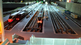
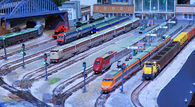
To be honest, a lot of it worked out okay, and as I look at some of the photos now of the former layout, I do go....'wait...why did I tear it down?'! However, in order to ensure that the record is clear, I decided to simply put out the four main mistakes or decisions that I made that ultimately (and maybe in conjunction with others) led to me being less and less dissastisfied with the layout. I will start with number four and work through the the number one reason I had to change the layout:
# 5 --- NUMBER FIVE --- #5
TRAM LINE BLUES:
When I put in my tram line back in 2009/2010, Kato's Unitram system was not yet released or available. I used the tight radius tracks from Tomix (which are fine) and I also used a plastic material for streets ( called 'sintra', the reason was to avoid the common challenge of plaster around the track). Unfortunately, the track needed constant cleaning so that the very light weight tram's could run on the track. In addition, cleaning this track was difficult because....
....there was a ton of detail on the streets!
Yes, the cars can be easily moved, but the street lights? Under constant threat of GIANT hand with a track cleaner wiping out a $10-$15 street light? What a pain! Yeah, I agree, it looks nice, but operations were bad and maintenance was a nightmare. I think Unitram will solve some of these issues, and next time (if there is a next time!) I probably won't run tram lines where its hard to clean!
# 4 --- NUMBER FOUR --- #4
LIGHT-CYCLE DEATH TRAP UNITRACK!
It's not so much that I had too much track/not enough scenery, its more a result of the fact that my layout was basically one addition after another (Quinntopia version 4 was added on to version 3, which was added on from version 2, etc... you get the picture). This is not the worst thing necessarily, but it did ultimately mean that my track plan resembled the 'light cycles' game from Tron - but with Unitrack!
So I had a nice long 'main line' but my two other lines were sort of confined within the outside line. Maybe not the worst thing, but everything was pretty much single track. Hello? I'm modeling TGV's and Shinkansen's and I have single track lines?
# 3 ---- NUMBER THREE ---- #3
TOO MANY SWITCHES....AND THE 'DEAD END' TERMINAL!
Yeah, the terminal looked great. But as far as how easy/practical/convenient/fun it was to move trains in and out of this terminal? Not fun. They went through a maze of switches on basically a long curve and I would have a derailment or power loss each time.
Again, it looks great! But getting trains in/out of that terminal was a pain! I think if I had chosen different switches (I still think the Minitrix R4 Polarized-frog switches I used for the 'throat' aren't too bad, but I won't be using them next time) I might have had different results. I think a complicating factor is that all the tracks sheer off the right in the below photo - creating what is in effect a lot of turnouts on a large curve. Bad news.
# 2 ---- NUMBER TWO ---- #2
I HATE WIRING. SWITCHES NEED WIRING.
Below is the ugly interior of my control panel. It looked nice from the outside and (believe it or not) it did work well enough! But I hated the mess! I avoided showing much of the wiring mess in any of the photos I ever posted, so the below is sort of a secret of the spaghetti of wiring that I had set up. Honestly, it was just depressing.
# 1 ---- NUMBER ONE ---- #1
EXPAND YOUR LAYOUT AND ENJOY SOME CLAUSTROPHOBIA.
The below schematic shows the expansion I call 'Quinntopia Version 4' in Yellow. While this yellow expansion section allowed me to have a nice long-running main line, a huge terminal with storage space for long TGV's and Shinkansen (yeah...see above!) it also took something away: Room for people.
Now, I'm not entirely an idiot...I did try to ensure that the areaa between the yellow expansion area and the older 'green' layout section had a good 30" of walking space. This area was the best spot to observe the layout - you would be surrounded on three sides by the layout when you were in this little U-shaped spot. But it felt claustrophobic. Only one person could ever really be there at any one time. You could watch the layout from other spots, but they are even more 'tight' or from an 'end' angle that doesn't show as much.
I just did not like the 'feel' much when I went into my train room. It felt 'crowded'.
It took a while, but I realized I missed my smaller layout (see below for the original size)- but it was far more 'comfortable' in the sense that there was plenty of room to watch and wander around.
So I think keeping the 'human element' (a "Feng Shui' of train layouts?) is important. My next layout will be smaller but I think (and hope) I'll enjoy it more because you won't feel so over-whelmed by it.---------------
So that's it! Like I said, most of this is about going too big, too fast. I don't regret it as it gives me new ideas and (I hope) smarter ideas on how to make the next version much more enjoyable and easier to maintain!


